Visual Storytelling on Multifamily Social Media
Every community has a story, and for many of us it’s important to tell it because it serves a purpose. From a multifamily aspect, the art of visual storytelling is significant because it helps relay messages to future and current residents about the daily life in a luxury apartment community. As a community, we want to convey positive messages that motivate our residents to continue leasing and, of course, tell others about it as well.
Social media plays a major role in marketing apartment homes to the public because it’s a direct reflection of your community’s brand. The images and messages that are emitted through different social media platforms give potential residents insight into the brand’s image, values, and efforts that the apartment community wishes to display. It also helps to interact and engage with residents on a more personal level, and to receive insight into their own stories as well.
Visual content is very important on social media because it outperforms other post-types like crazy. In fact, it’s been shown that content posted on any social media site that is accompanied with an image is more likely to be viewed than just plain text, especially on sites such as Twitter and Facebook. This is why brand consistency is important in your multifamily marketing plan.
Because each social media platform has a different use and angle for posting images and content, there are standard tips that can be used in order to maximize the reach of the images that your business puts out. What differentiates the good from the bad? Most importantly, how can you make sure that the content that you post is receiving the maximum amount of engagement? Here are some tips for how to execute visual storytelling on multifamily social media that will help you connect more with your audience.
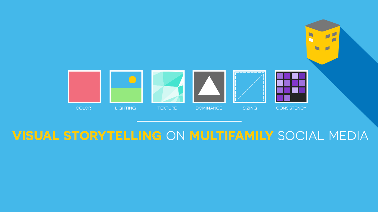
Color
The colors that you choose for your photos play a very important role in how your content will be perceived. Different colors and hues perform better or worse depending on the social media platform. For example, research has shown that photos on Instagram with blue as the dominant hue perform better than any other color. On Facebook, however, any variation of blue is not so popular, but your content will flourish if you post images displaying green and yellow hues. For Pinterest, the best color for images is red. We chose to show off Alta Woodlake Square in Houston for spotlighting their yellow-hued clubhouse.
Lighting
An image can be simply amazing, yet get passed upon due to poor lighting. Make sure that your images are not too dark and the contrast in colors is not too harsh. Very dark images with very little contrast between the subject and the background perform considerably poor compared to those that exhibit stark contrast between elements. Respectively, you want to make sure that your images are not washed out with too much lighting either. Pick a perfect medium and go from there. Vantage Lofts in Las Vegas posted this image with great use of lighting from the sun shining through the clouds over Sin City.
Texture
Be mindful of the different textures that you use in your photos as well. Some textures are more appealing on different sites than others. For example, Pinterest users are more likely to repin photos that are smooth in texture with stark contrast between the background and subject. Facebook and Instagram users, however, are more likely to engage with photos high in texture and saturation, kind of like the one above from Alta City West Apartments.
Dominance
Nothing screams a good image like one where the subject clearly stands out. This works particularly well with images posted on Instagram and Pinterest. In these cases, it’s best to keep the background as simple as possible so that the subject of your photo stands out the most. Also, make sure that the background does not clash with the focal point in the photo. Keep in mind that you can never go wrong with a white or a pale background in this case. This photo by Alta Heights Apartments has the blue lounge chairs taking over, while still showing off what’s behind.
Size and Dimension
Want to know what’s visually pleasing? How about an image that fits perfectly within the confinements the platform that’s being used? When taking photos or creating content, be mindful of the different ratios and dimensions that vary across each social media site. There’s nothing worse than posting an image that is cut off or pixelated because the sizing is wrong. Instagram standard photo-sizing is fairly simple as all photos posted in the photo feed are uniform in size. Other sites are more complex because they offer different dimensions based on where you want the photo to be displayed on your profile. Here’s a complete guide to social media dimensions for reference. Arborpoint at Woodland Station did an excellent job at framing their collage just right so nothing would get cut off when posted to Instagram.
Consistency
Be consistent with the content that you post. The most successful brands pick a specific theme and follow through in every post made. It can be as subtle as using a particular color scheme like 360 Residences in San Jose did above. If your community wants to present multiple angles, you may want to post a variety of creative shots showcasing the apartment homes in different ways. Whatever you choose, make sure that you remain consistent with what you put out.
There are dozens of other strategic ways to market your visuals on social media, but we’ve highlighted a few of the most important ones to follow for the best success. No matter what, be creative, have fun and stay true to your community’s brand.